
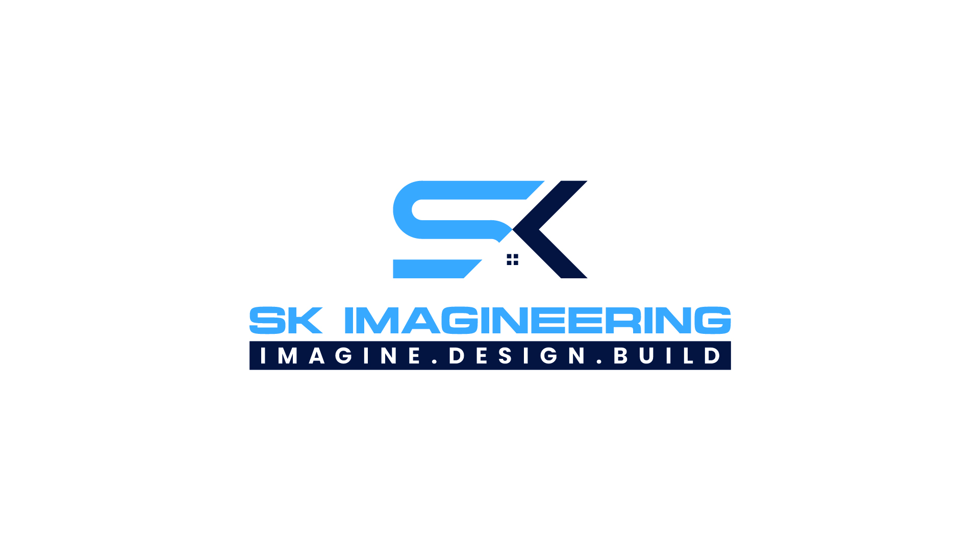
Logo Design Case Study
At HH Creates, we believe that every brand identity should do more than just look appealing it must communicate purpose, convey professionalism, and create a memorable visual impression. Our recent logo design project for SK Imageneering, a construction and engineering solutions provider, stands as a perfect example of how strategic creativity can transform a brand’s presence. SK Imageneering approached HH Creates with a clear requirement, “We need a construction-inspired symbol and a corporate, unique representation of the letters SK.” Understanding the competitive nature of the construction and engineering industry, we aimed to create a logo that feels bold, modern, trustworthy, and structurally strong qualities that represent the client’s business identity.
Concept & Creative Direction
Our mission was to translate two simple letters—S and K—into a meaningful, future-focused brand icon. The design had to instantly resonate with an audience involved in construction, architecture, and engineering spaces. To capture these expectations, we followed a clear design approach
1. Structural Symbolism
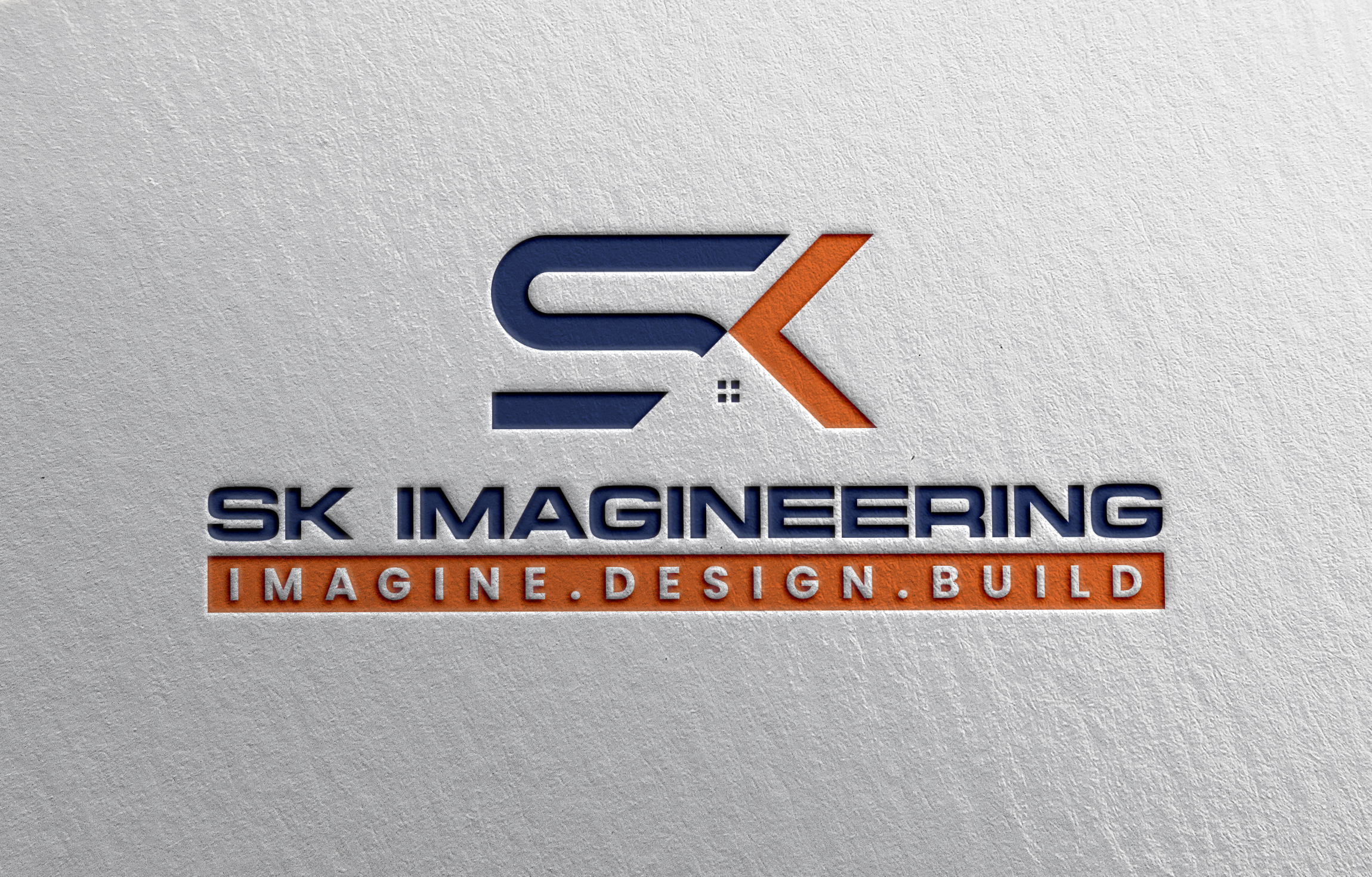
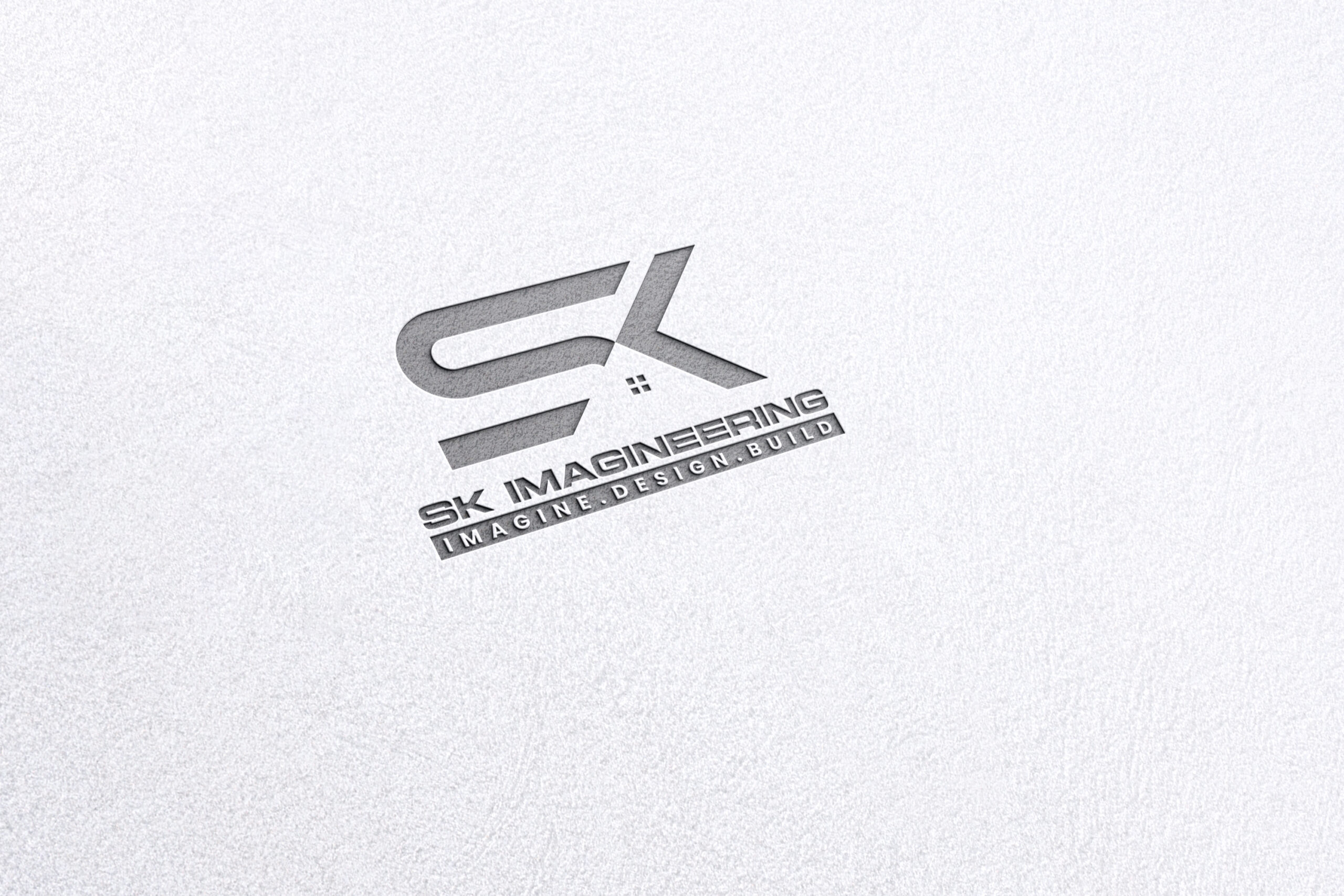
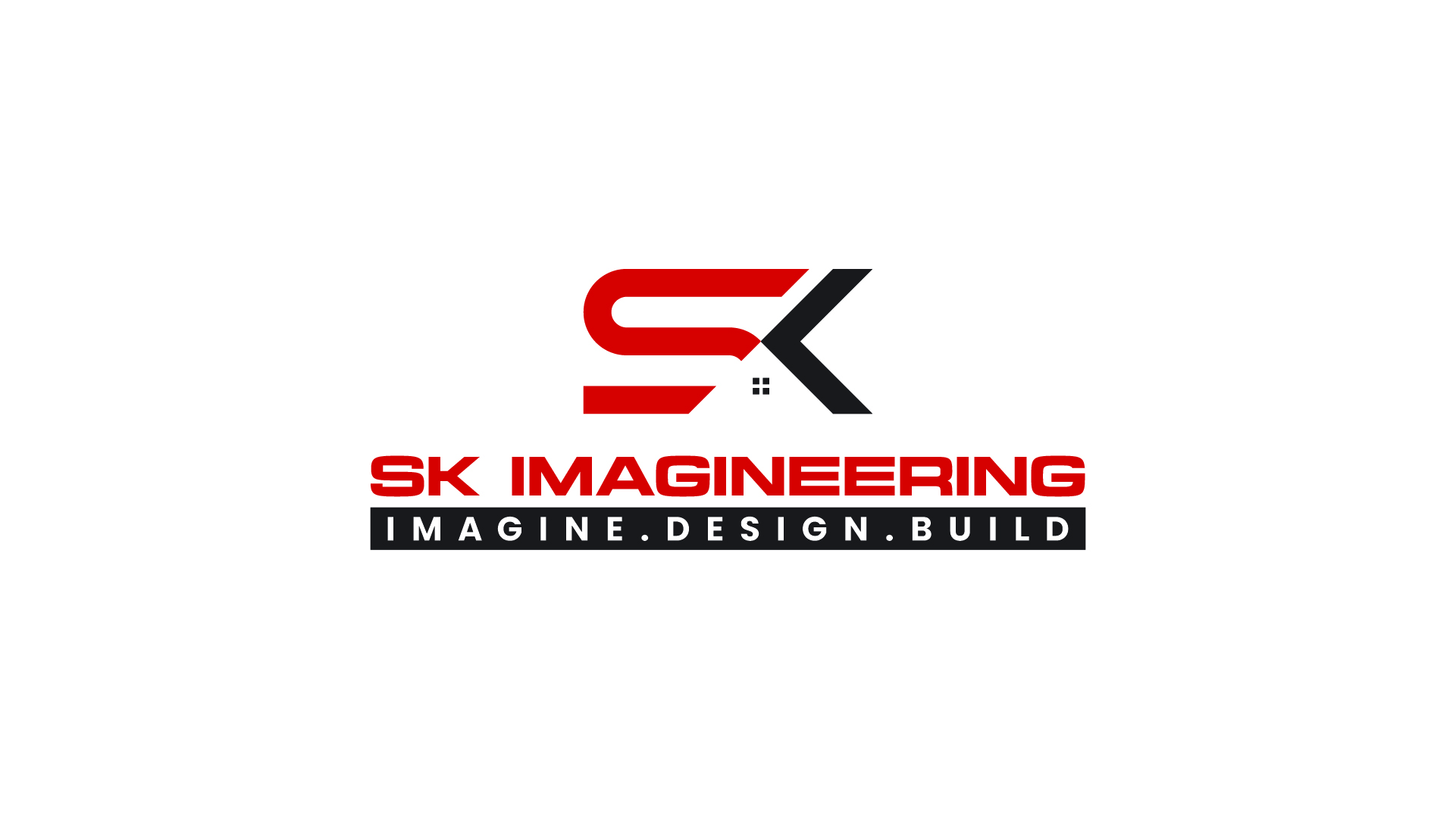
The main SK icon is crafted with clean, sharp lines that mimic the precision and discipline found in engineering and construction. The balanced proportions and minimalistic geometry reflect strength and stability two qualities at the heart of SK Imageneering. This element becomes a key identity marker and adds depth to the minimalistic SK mark. The subtle window-like grid element inside the logo symbolizes:
- Construction projects
- Buildings and architectural details
- Engineering precision
- Attention to detail
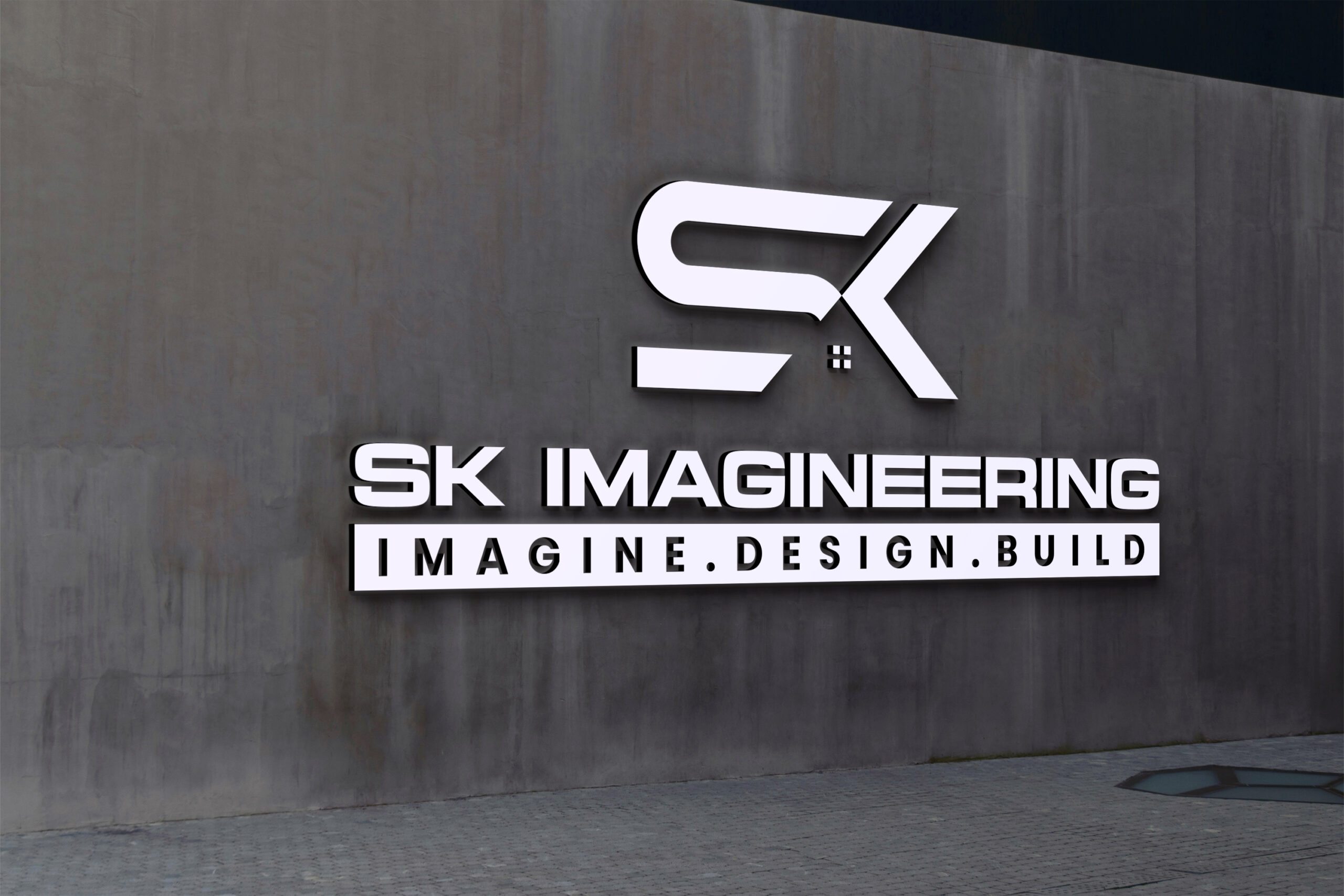
2. Tagline Integration
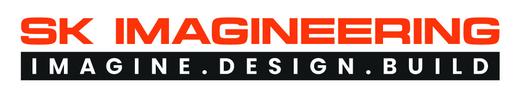
SK Imageneering already had a strong conceptual tagline. Our goal was to integrate it in a way that feels cohesive and authoritative. By placing the tagline in a solid black block with white spaced typography, we ensured:
- Perfect contrast
- Enhanced prominence
- A structured architectural feel
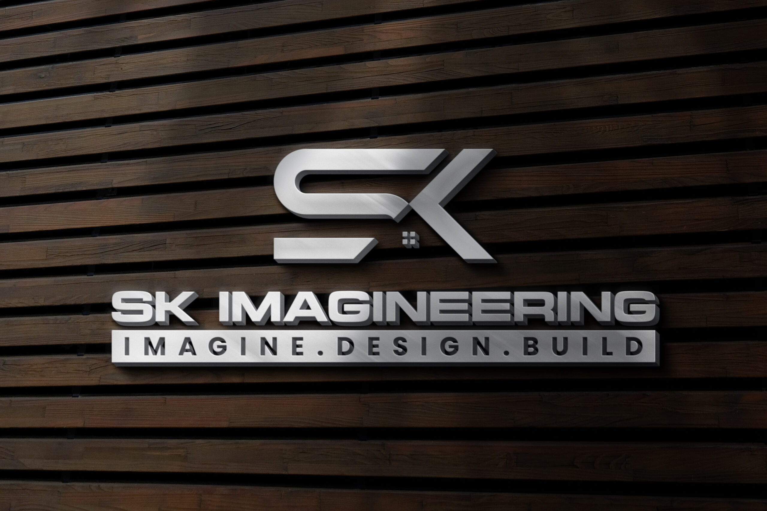
3. Why This Logo Works?
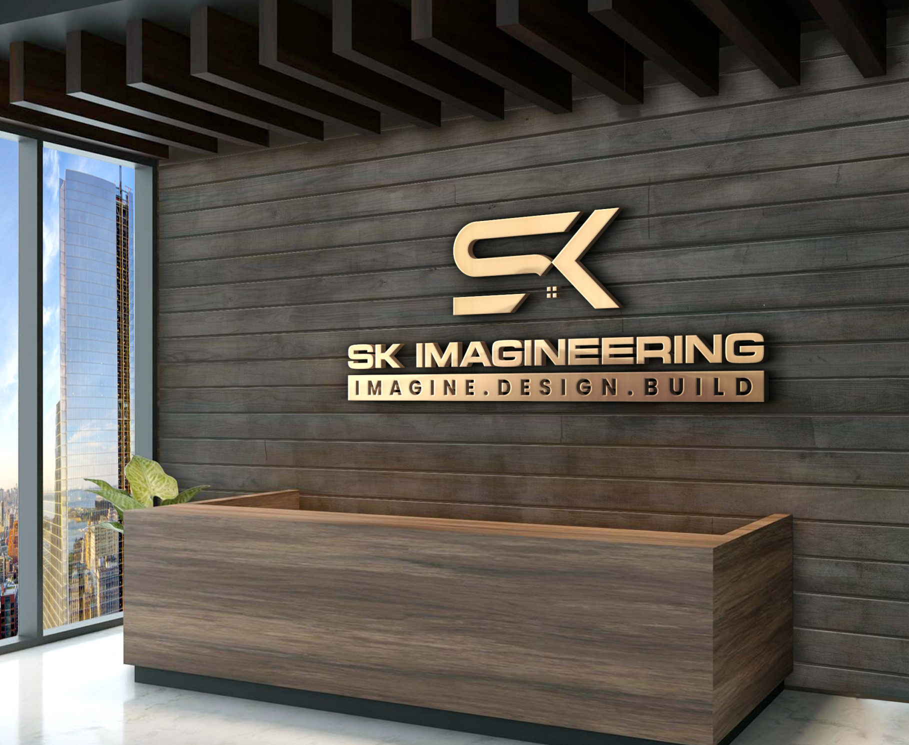
The balance of minimalism and structure ensures that SK Imageneering has a strong, long-lasting brand visual that reflects both craftsmanship and vision. The final logo for SK Imageneering is:
- Memorable – A bold SK icon that is instantly recognizable
- Symbolic – Infused with construction and engineering cues
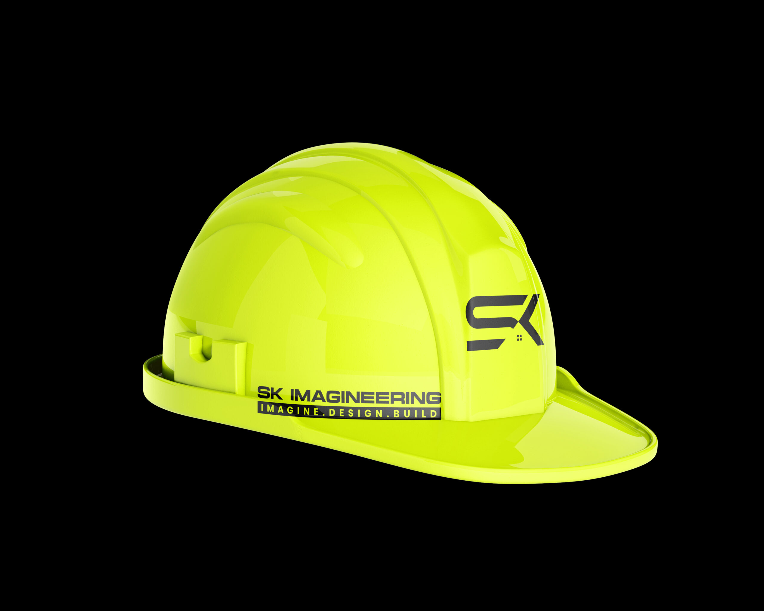
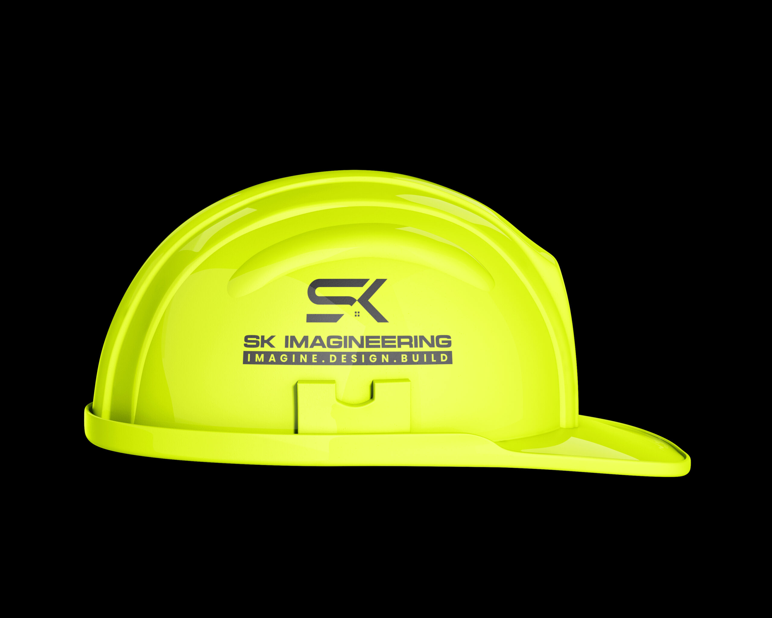
- Versatile – Works seamlessly across uniforms, signage, vehicles, stationery, and digital assets
- Professional – Clean corporate styling
- Modern – A polished, future-ready identity that aligns with evolving market expectations
Conclusion
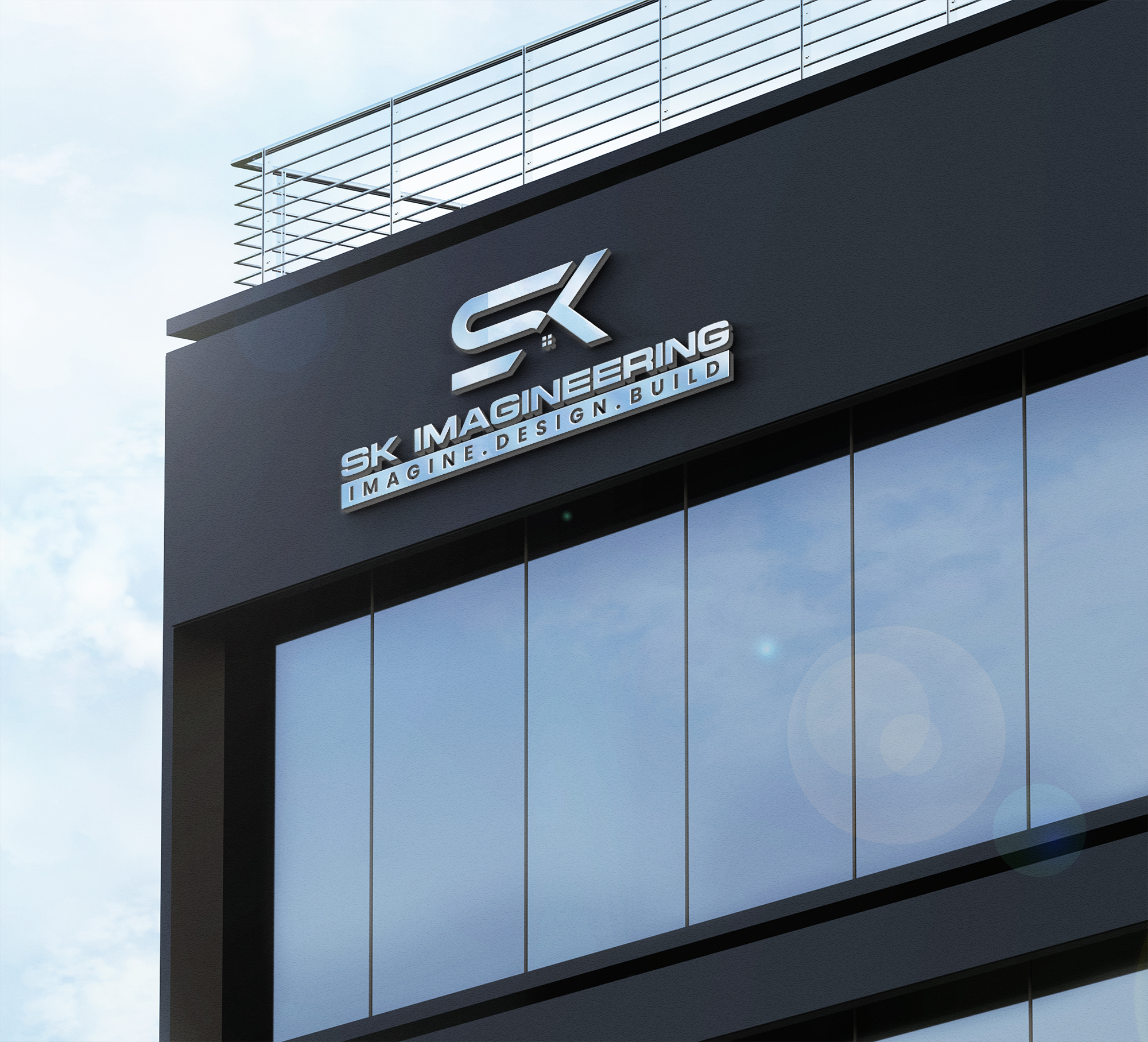
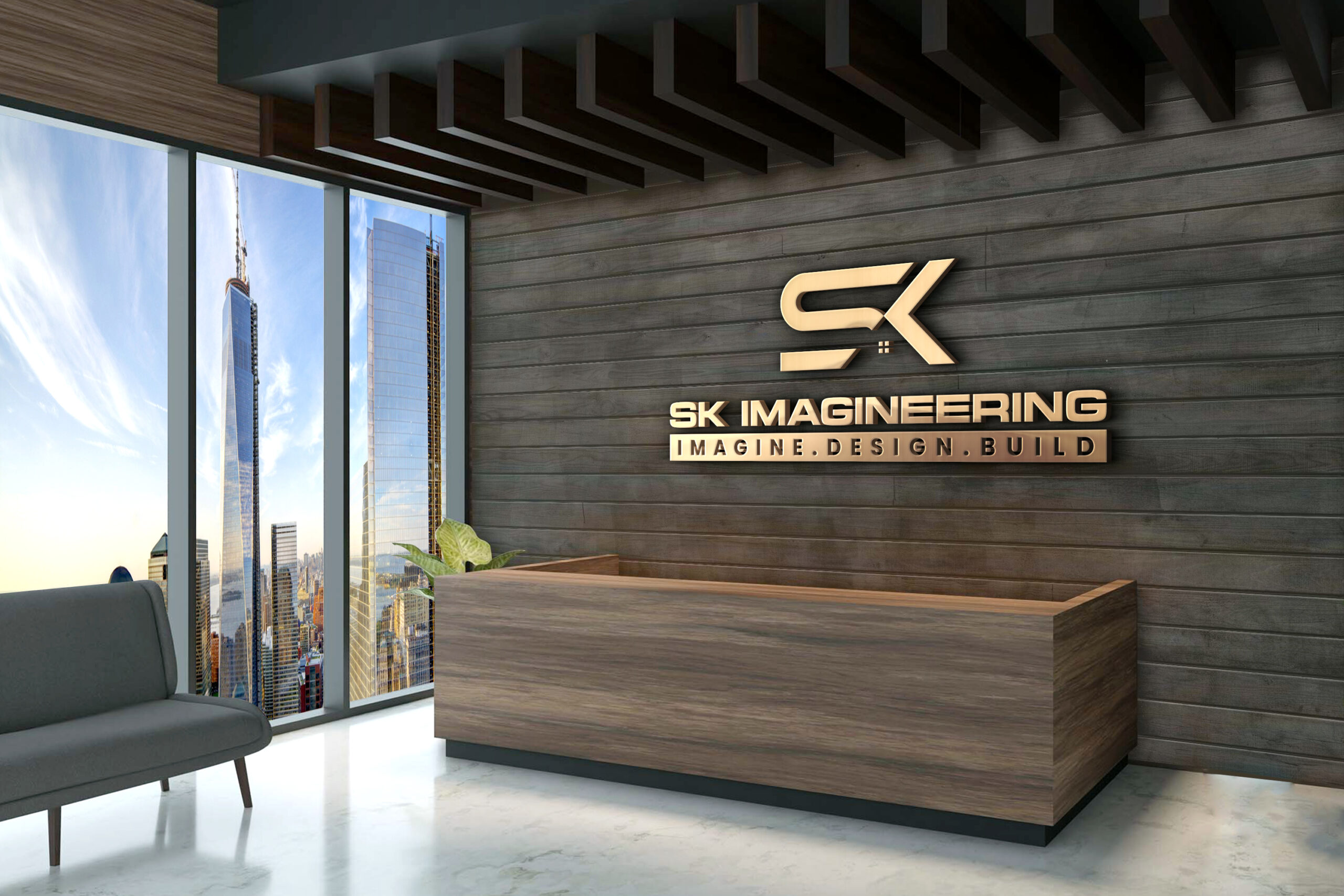
A Strong Identity for a Vision-Driven Brand. At HH Creates, we are proud to have transformed SK Imageneering’s expectations into a powerful logo that communicates who they are and what they stand for. Every detail from color selection to font styling, icon design, and layout has been thoughtfully crafted to build a brand identity that stands tall in the competitive construction industry. This project represents our commitment to creating branding solutions that combine strategy, creativity, and business value. SK Imageneering now carries a visual identity that is bold, confident, and perfectly aligned with their tagline: IMAGINE. DESIGN. BUILD.

Boost Your Business &
Start Your Project Today
About Us
HH Creates an top & best digital marketing agency specializing in Branding, Web Design, Software Development & Digital Marketing.
Reach Us
- Address: 372, Mallavadi, Tiruvannamalai, Tamil Nadu, India, 606805.
- Phone: +91 93607 86940
- E-mail: support@hhcreates.org